
Our product was a sophisticated social listening tool where data played a critical role. Typically, products that dealt with large volumes of data exhibited inherent complexities. In such environments, filtering content became a crucial feature as it directly influenced the user’s ability to quickly access relevant information.
Case
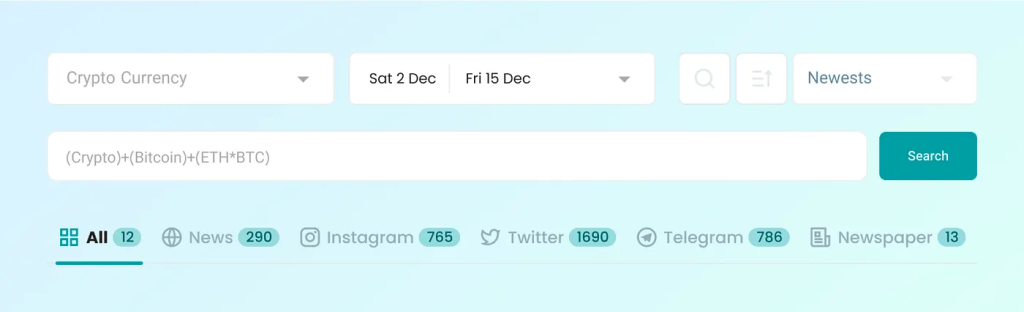
At that time, we had many filters on the main page of Dataak, and their number was not small. From my perspective as a designer, features like topic, time range, and search box were also considered filters. Why? Because anything that could be adjusted was recognized by our users as a filter. The number of these filters had become so large that sometimes even in meetings we got confused and didn’t know which filter was applied that resulted in a particular outcome. Social listening products were inherently heavy and complex, and we had to reduce these complexities as much as we could.
Problem
One of the significant challenges we faced with our social listening platform was the complexity and lack of transparency associated with the filter system. Users frequently struggled to determine which filters were active, often leading to confusion and frustration due to unexpectedly limited or inaccurate search results. Additionally, there was a noticeable lack of understanding about the functionality and implications of each filter, complicating the user experience further. This issue not only affected our end-users but also posed a challenge during internal team discussions, where even members of our team found it difficult to track which filters had been applied. The need to make the filtering process more intuitive and user-friendly was clear, to ensure that users could efficiently navigate and utilize the platform to its full potential, accessing the precise information they needed without unnecessary complexity.
Data Gathering and User Research Methods
In order to deeply understand the issues our users were experiencing with the filter system and to refine our design approach, we employed a comprehensive data gathering strategy. This involved three key methods:
1. User Interviews:
We conducted detailed interviews with a range of stakeholders. These interviews helped us to capture the frustrations and needs directly from the users, providing us with valuable feedback on the existing system and suggestions for improvements.
2. Behavioral Observation through Clarity:
To supplement the insights gained from the interviews, we utilized Microsoft Clarity, to observe how users interacted with the filter interface. This allowed us to visually and quantitatively analyze user behaviors such as clicks, scrolls, and mouse movements, giving us a clearer picture of user engagement and areas of potential confusion within the filter system.
3. Database Analytics with Elasticsearch:
To quantify the usage of different filters, we tapped into our backend data using Elasticsearch. This powerful search and analytics engine enabled us to analyze large volumes of data to determine which filters were most frequently used and which were often ignored. This data-driven approach provided a solid foundation for our decision-making process, ensuring that any changes to the filter system were backed by actual user engagement statistics.
Strategy
We need to break down major and complex problems into small and simple issues, and for each small issue, take appropriate actions based on the resources available to us. Essentially, we should dissect the subject matter.
All aspects of the product filters are integrated into the search pages. To comprehensively assess filter-related elements, we meticulously examine each relevant part individually.
Filters encompass more than just the left-side filter button on the product. There are other related elements on the page, but for now, we’ve only considered those on the left side as filters to design with greater focus.
Solution
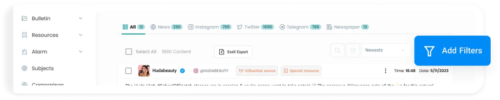
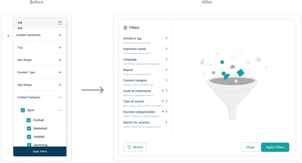
Firstly, we redesigned the display format of the filter button. Previously, it was positioned as a tab on the right side of the product, which made it challenging for new users who hadn’t completed onboarding to find it easily. I relocated this button above the content section and emphasized it using our blue alert color. Additionally, I included the word “Filter” alongside the icon on the button. This adjustment ensures that users can immediately identify a button labeled “Filter” next to its icon, which was crucial for initial user engagement.
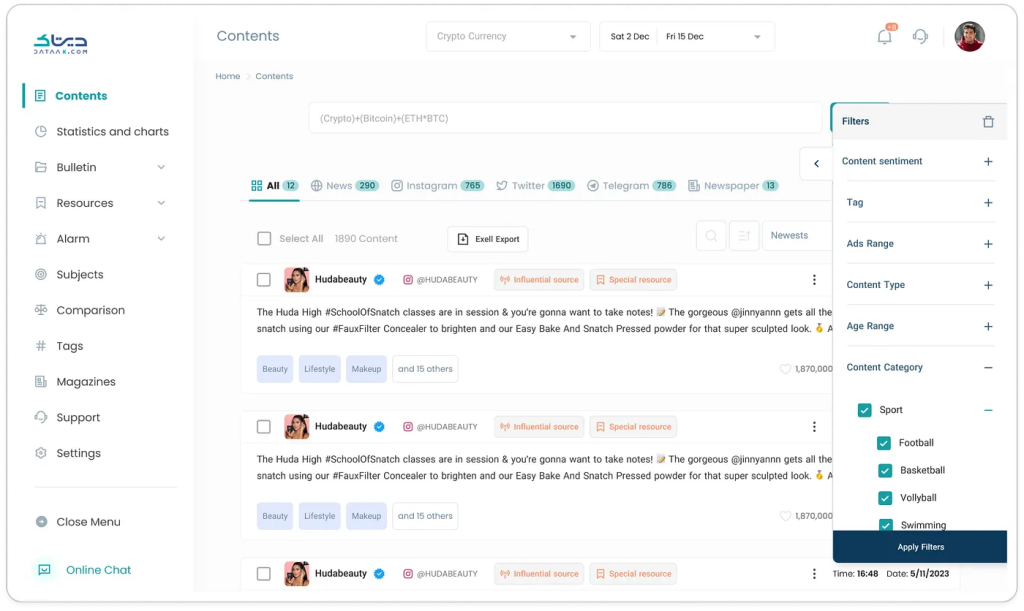
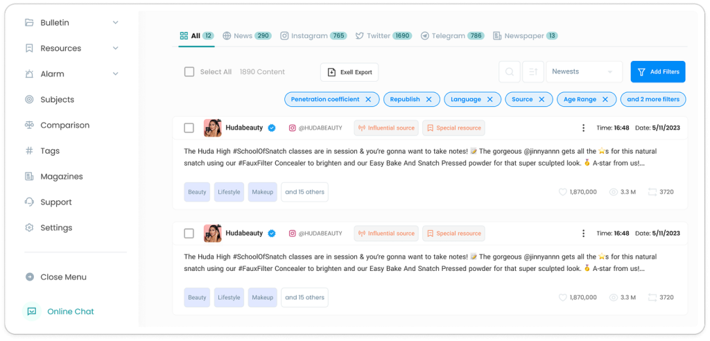
Another issue we faced was that users couldn’t easily recognize which filters were currently applied and which ones were not. To check this, they always had to open the right-side panel and scroll through the list of filters to see what was active.
In the redesigned version, I introduced chips from our design system to make active filters more visible. Each time a filter was applied, it appeared as a chip inside a dedicated box placed above the filter button, accompanied by a close icon. This way, users could instantly see all active filters in one place and remove them with a single click if needed.
Another challenge we identified was the way filters were displayed. Previously, filters opened from the side of the screen in a narrow panel. This layout created two main issues: first, when users applied certain settings, filters were activated without them noticing; and second, the limited space of the side panel made the interface feel cluttered and difficult to scan.
To address this, I redesigned the filters to open in a centered modal. This approach not only provided a cleaner and more focused visual experience, but also gave us more room to improve the copywriting and clarify the filter options. As a result, users had a clearer understanding of their actions and the interface felt more intuitive overall.
Results
While I cannot disclose the organization’s internal data, we conducted usability tests and follow-up user interviews after rolling out the new filter design. The results were clear: users reported far less confusion around which filters were active, and the mistakes they previously encountered — such as unknowingly applying filters — dropped significantly.
Moreover, feedback from our B2B and B2G users confirmed that filters had become a central part of their workflow. Compared to the earlier version, where filter usage was noticeably lower than expected, the redesigned solution encouraged active and confident use of filters, aligning the product’s functionality with its intended value.
Additional Validation
Since I couldn’t disclose the organization’s internal data for privacy reasons, I focused on alternative ways to validate the redesign’s impact. I leveraged three main approaches:
- Microsoft Clarity — to observe user behavior visually, tracking clicks and interactions on the filter components.
- User interviews and usability tests — I conducted short remote sessions, including phone calls with B2B users, to gather qualitative feedback on how they experienced the redesigned filters in their daily workflow.
These methods combined gave me a clear signal: the redesign successfully reduced confusion, improved visibility of active filters, and increased overall engagement with the filtering system.